

Build an Awesome KPI Excel Dashboard in just 5 Minutes - Interactive Sales Dashboard
8,727
Socialcounts.Org
88
likes
3
comments
daily view 0
monthly view 0
Live Analytics
Comments 0
Build an Awesome KPI Excel Dashboard in just 5 Minutes - Interactive Sales Dashboard Analytics Table
Income Estimates for Build an Awesome KPI Excel Dashboard in just 5 Minutes - Interactive Sales Dashboard
Based on this YouTube video's total view count of 8.72K views and industry-standard rates, the estimated total earning is $6 - $17 through ad revenue. Historical data is not yet available to calculate daily, weekly, or monthly averages.
About Build an Awesome KPI Excel Dashboard in just 5 Minutes - Interactive Sales Dashboard
Explore Build an Awesome KPI Excel Dashboard in just 5 Minutes - Interactive Sales Dashboard with 8,727 views, 88 likes, and 3 comments. Experience the impact of this video content that has captured audience attention.
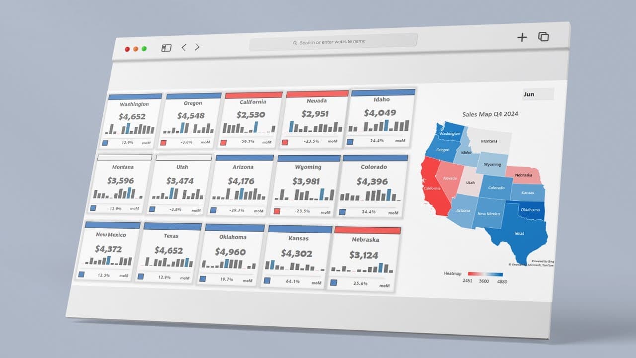
In this tutorial, you'll learn how to build an interactive Excel Dashboard that uses dynamically colored shapes based on a cell value. 🔔More Dashboards: https://exceldashboardschool.com/cat/free-templates/ Follow the video, to create an interactive Excel dashboard that dynamically tracks key performance indicators (KPIs) using drop-down menus, sparklines, and a dynamic sales map. 🔥 What You'll Learn in This Video: ✅ How to create a drop-down list to select a specific month. ✅ How to link and calculate values for the selected and previous period using XLOOKUP. ✅ How to insert and format shapes to display performance trends. ✅ How to use formulas to calculate variance between months. ✅ How to create a heatmap-based sales map to visualize performance across regions. ✅ How to apply conditional formatting to dynamically change colors based on performance. 📌 Key Steps in the Tutorial: 1️⃣ Create a Drop-Down List: Insert a drop-down list to filter data by month. 2️⃣ Calculate Performance Metrics: Use XLOOKUP to pull actual & previous month values. 3️⃣ Design KPI Cards: Insert shapes, link values, and customize colors dynamically. 4️⃣ Visualize Performance Trends: Add sparklines to show historical data at a glance. 5️⃣ Apply Conditional Formatting: Make colors change dynamically based on results. 6️⃣ Insert a Sales Map: Use Excel’s built-in map chart to create a geographic KPI overview. 7️⃣ Refine & Customize: Adjust layout, colors, and labels to create a professional dashboard. Chapters: 00:00 Intro 00:11 Data structure, Formulas 00:52 How to Build an Interactive Excel Dashboard 01:32 Dynamic shapes and KPI structure 02:37 Insert a Map 02:48 Customize the Map 📩 Got questions? Drop a comment below! 👍 Enjoyed the video? Like & Subscribe for more Excel dashboard & automation tutorials! 🔔 Turn on notifications to never miss an update! #excel #exceltips #exceltutorial #datavisualization #exceldashboard #exceldashboardstutorial
About YouTube Real-Time View Count
With SocialCounts.org’s view counter, track your YouTube video’s live view count and YouTube likes count in real time with fast, reliable updates.
Watch every YouTube video live view count rise with our real-time YouTube views tracker—built for accuracy and minimal delay.
Follow YouTube real time views as they happen, using our dedicated view counter for YouTube videos.
Get up-to-date live view count on YouTube and see real-time growth with SocialCounts.org’s smart tracking tools.
Embed Widget
Parameters:
fullscreen=true- Fullscreen countergraph=true- Live graph chartcounter=0/1/2- Select counter (0=likes, 1=views, 2=comments)
URL
Click to copy the embed URL to your clipboard