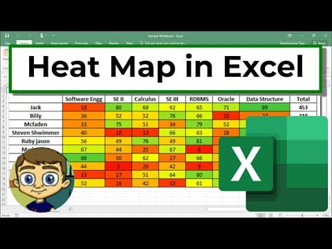
Create a Heat Map in Excel
Published September 13, 2021
Views 181K | Likes 1.54K | Comments 18

At a glance
Views
181,830
Likes
1,541
Comments
18
Performance vs. channel
Outlier score
Engagement rate
More features coming
We're working on new analytics and tools. Stay tuned.
About
Learn how to create a "Heat Map" effect in your Excel data. This technique helps to quickly draw attention to what the data means, even at a glance. ***Consider supporting Technology for Teachers and Students on Patreon***: https://www.patreon.com/technologyforteachersandstudents Here's my entire playlist of Excel tut…
- Published
- September 13, 2021
- Made for kids
- No
More features coming
We're working on new analytics and tools. Stay tuned.